https://instagram.com/p/7Ic9RpL98M/
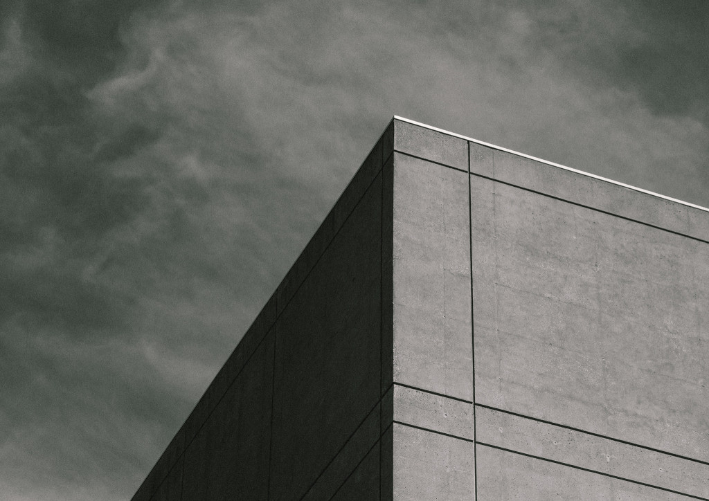
A fine minimal moment from Instagram user, @korofina. On a day that’s grey, this architectural photo is a feast for artistic and natural beauty.
for the love of DC photography
https://instagram.com/p/7Ic9RpL98M/
A fine minimal moment from Instagram user, @korofina. On a day that’s grey, this architectural photo is a feast for artistic and natural beauty.
https://instagram.com/p/4lGh_-p4Fx/
Instagram user Sean O’Donnell’s images are striking. I love the overexposure and the wonderfully odd perspective of this building by the architect Ludwig Mies van der Rohe.

The best way to excite me is with simple architecture and geometry. I’m also really fascinated by the grain and texture of Zack Lewkowicz‘s photograph. His title is perfect—Inward Outward. If you focus on the top corner of the building, he indicates that it becomes an optical illusion. Does it change for you?
By Heather Goss

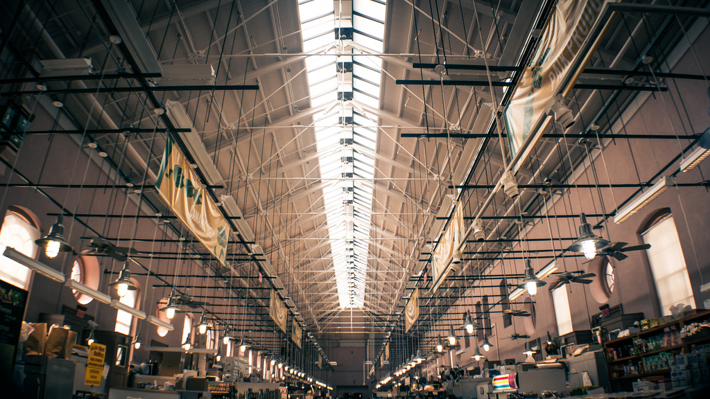
I love a deceptively simple-looking architectural photo. John Griffiths worked some magic with the exposure of Eastern Market’s ceiling, managing to fill the darker walls and market stalls under the overhangs, without overexposing the rafters near the skylight. The soft light gives the large warehouse the aura of a cathedral.