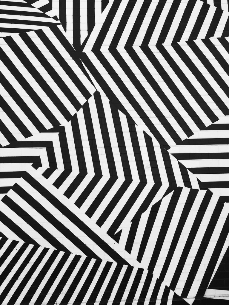
When I first saw this photo by Noe Todorovich I thought, “Yes!” This is such great use geometry and pattern.
for the love of DC photography

When I first saw this photo by Noe Todorovich I thought, “Yes!” This is such great use geometry and pattern.

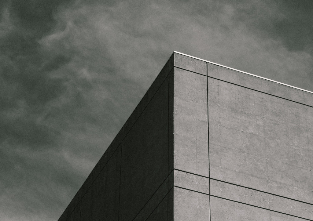
The best way to excite me is with simple architecture and geometry. I’m also really fascinated by the grain and texture of Zack Lewkowicz‘s photograph. His title is perfect—Inward Outward. If you focus on the top corner of the building, he indicates that it becomes an optical illusion. Does it change for you?